
Crypto UX Dark Patterns in 2026: Where Users Lose Money Without Realizing It May, 2026
Crypto UX has improved in 2026, but many interfaces still quietly push users into costly mistakes. This guide breaks down the most common dark patterns in crypto products and how users lose money without realizing it.
 Written by Nikolas Sargeant
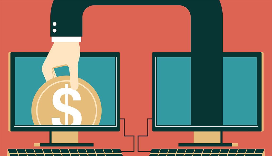
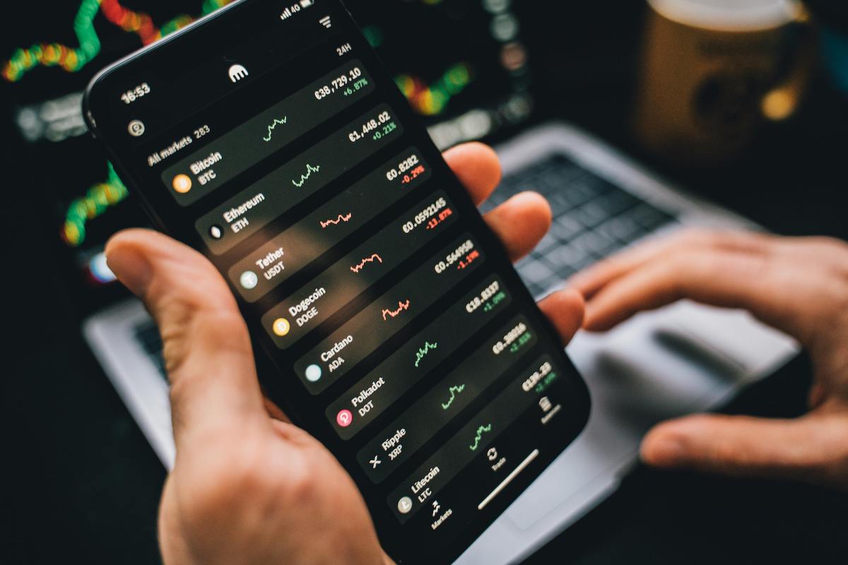
Crypto UX in 2026 looks cleaner than ever: fewer scary warnings, more “one-click” flows, and interfaces that feel as smooth as fintech. But that polish often hides the most expensive part: subtle design choices that nudge users into approvals, fees, and risk they didn’t intend to take. In crypto, a confusing UI isn’t just annoying. It can be irreversible.
The shift is measurable. Approval phishing, where a user is tricked into authorizing token spending, has become a major loss category. Chainalysis estimates that at least $374 million was stolen through approval phishing in 2023 alone. Wallet drainer campaigns expanded even further in 2024, with security firms reporting close to $500 million stolen from hundreds of thousands of addresses using automated drainer malware.
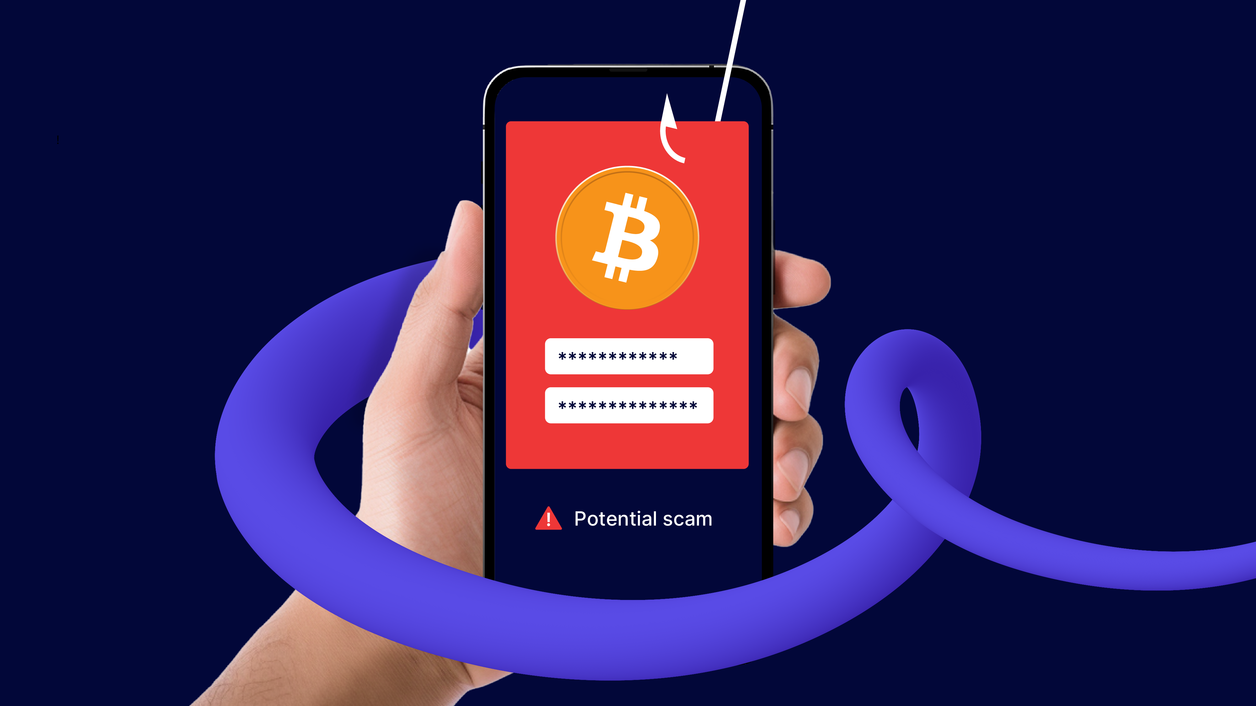
Real-world snapshot: “I only signed a message.”
A recurring pattern in modern crypto losses is victims believing they are performing a harmless action such as signing a message, connecting a wallet, or approving a routine request. In reality, they are granting powerful permissions that allow assets to be moved later without further confirmation.
- In the 2022 OpenSea phishing incident, users received emails urging them to “migrate” listings. The flow looked legitimate, but users ended up signing malicious approvals. Dozens of wallets were drained, and NFTs worth roughly $2 million were stolen.
- In 2024, a widely reported Permit2 phishing case involved a PEPE holder losing approximately $1.4 million after signing an off-chain approval tied to Uniswap’s Permit2 system. The danger of this pattern is that a single signature can authorize future transfers without additional user interaction.
- In January 2026, another case highlighted the same issue. A user reportedly lost around $1.08 million after signing a malicious permit signature. The interface emphasized “no gas, just sign,” masking the fact that the signature granted full spending authority. The UX made the action feel safe, even though the authorization was not.
This article is not about “gotcha” scams only. It’s about the grey zone where growth-driven UX, complex protocol mechanics, and ambiguous language combine into predictable user losses: hidden fees, deceptive defaults, permission traps, urgency screens, and “simplified” flows that prevent users from understanding what they’re agreeing to.
What you’ll learn in this guide
- The top dark UX patterns in crypto products in 2026 (with real examples users encounter)
- How these patterns translate into losses (fees, slippage, approvals, liquidation risk)
- How to spot red flags before you click “Sign” or “Confirm”
- Practical habits to reduce risk without becoming a power user
Note: This is educational content, not financial advice. Examples are used to illustrate UX patterns and common failure modes, not to accuse specific products of wrongdoing.

What “Dark Patterns” Mean in Crypto (and Why They Hit Harder in 2026)
A “dark pattern” is a design choice that nudges people toward an action that benefits the product more than the user. In normal apps, that usually means you get tricked into subscriptions, extra fees, or giving away data. In crypto, the same UX tricks can create direct, irreversible financial outcomes because clicks and signatures can move real money.
In 2026, crypto apps often market “simplified” experiences: fewer prompts, faster confirmations, and cleaner screens. That simplicity is not always safer. It can hide critical details like who gets permission to move your tokens, how much you are paying in total fees, what settings are defaulted to risky values, or what happens if a transaction fails halfway through a multi-step flow.
Why crypto dark patterns are different from Web2 dark patterns
- Transactions are final: There is no chargeback, no “undo,” and support usually cannot reverse mistakes.
- Risk is bundled into simple actions: “Approve,” “Sign,” “Swap,” and “Bridge” can each carry hidden consequences.
- Costs are dynamic: fees, slippage, and route execution can change between intent and confirmation.
- Security and UX overlap: A confusing interface is effectively a security vulnerability.
Real-world examples of “harmless” UX that triggered real losses
The most common high-impact pattern is a screen that makes an action feel routine when it is actually granting dangerous authority. Users often describe these incidents the same way: “I only connected my wallet,” or “I only signed a message.”
- Approval phishing: victims are persuaded to sign approval-style transactions that allow an attacker’s contract to spend tokens later. Chainalysis reported large-scale losses tied to approval phishing networks, showing how signing the wrong approval can act like giving away your wallet’s spending power.
- Wallet drainers: phishing sites that mimic real products and trigger a sequence of signature requests. The UI typically looks normal, but the signatures are crafted to transfer assets out as soon as they are granted.
- “Convenience” approvals like Permit-based flows: signatures designed to reduce friction can also reduce user awareness. When a signature replaces an explicit on-chain approval transaction, users are more likely to assume it is safe because it looks like a simple login step.
How we will evaluate a crypto UX pattern in this guide
Not every confusing screen is malicious. To keep this practical, we will treat a UX pattern as “dark” if it meets at least two of these criteria:
- It hides or minimizes a material cost (fees, slippage, liquidation risk, lockups, or permissions).
- It uses risky defaults while presenting them as normal or recommended.
- It increases urgency or emotional pressure (timers, scarcity, “act now” copy).
- It creates ambiguity about what a click or signature actually authorizes.
- It makes the safer option harder (buried toggles, extra steps, confusing labels).
Next, we’ll start with the most common place users lose money without realizing it: fee obfuscation and pricing screens that hide the true cost until the last moment.
Fee Obfuscation: Where Money Leaks Out Quietly
Fees are one of the easiest places for dark UX patterns to hide because users already expect crypto to be expensive. By 2026, most interfaces no longer show a single obvious fee. Instead, costs are fragmented across gas, protocol fees, routing fees, priority fees, relayer fees, and price impact. The problem is not that these costs exist. The problem is how often interfaces delay, minimize, or abstract them until the user is already committed.
How fee obfuscation usually works
- Delayed disclosure: the interface shows a clean headline price first, with the full cost only visible on the final confirmation screen.
- Incomplete estimates: “estimated fees” that exclude slippage, priority fees, or downstream execution costs.
- Bundled costs: multiple protocol and network fees collapsed into a single vague line item.
Real-world examples users run into
DEX aggregator routing. Many swap interfaces advertise the “best price” without clearly showing that the trade will be split across several liquidity pools. Each hop introduces its own fee and price impact. Users often notice only after execution, when the received amount is materially lower than expected, even though the trade did not technically fail.
Bridge transactions. Cross-chain bridges frequently display a flat bridge fee up front, while hiding validator fees, destination gas costs, or relayer premiums until the final step. In periods of congestion, users have reported paying significantly more than expected just to receive funds on the destination chain.
NFT marketplaces. Creator royalties and marketplace fees are sometimes shown only at checkout, not when browsing prices. Users anchoring on the listed price are often surprised to see their net proceeds reduced by several percentage points after a sale.
Why users fall for it
- Anchoring: users mentally lock onto the first price they see.
- Time pressure: fast-moving markets encourage quick confirmations.
- Learned helplessness: many users assume fees are unavoidable and stop scrutinizing them.
Fee obfuscation rarely looks like a scam. It looks like polish. But when costs are fragmented and hidden behind “estimated” labels, users consistently pay more than they intend to without understanding why.
Next, we’ll look at deceptive defaults, where the interface quietly chooses risky settings on the user’s behalf.
Deceptive Defaults: When the Interface Chooses Risk for You
Defaults are powerful. Most users assume that whatever is pre-selected has been chosen because it is safe, reasonable, or recommended. In crypto products, defaults often optimize for speed, liquidity capture, or platform revenue rather than user safety. Losses that follow are usually blamed on market conditions, even when the interface quietly increased risk from the start.
Common risky defaults in crypto interfaces
- High slippage tolerance: swaps defaulting to one to three percent slippage even in thin or volatile markets.
- Leverage preselection: perpetual trading screens opening at five times or ten times leverage.
- Fast transaction modes: priority gas or “fast” execution selected by default during congestion.
- Auto-compounding yield: earnings automatically reinvested without clear risk or lockup disclosure.
Real-world examples users encounter
DEX slippage defaults. During volatile periods, a high default slippage setting can allow a trade to execute at a much worse price than expected. Users often do not notice the slippage setting at all because it is buried behind an advanced menu. The trade succeeds, but value is quietly lost to arbitrage.
Perpetual futures platforms. Many derivatives interfaces load with leverage already enabled. New or casual users sometimes open positions without realizing the leverage multiplier is active, increasing liquidation risk dramatically. When the position is liquidated, it feels like bad luck rather than a design choice.
Yield dashboards. Some yield products default to aggressive strategies that chase the highest APY. Risk disclosures are present, but they are often hidden behind tooltips or separate pages that most users never open. Losses occur when strategies unwind or liquidity dries up.
Why defaults work so well
- Implied endorsement: users treat defaults as recommendations.
- Cognitive load: crypto already feels complex, so users accept pre-filled settings.
- Outcome bias: losses are blamed on markets instead of interface design.
Deceptive defaults rarely look deceptive. They look helpful. But when risk is pre-selected and buried, users are exposed before they even understand what they are agreeing to.
Next, we will examine permission traps, where simple approvals grant far more power than users realize.

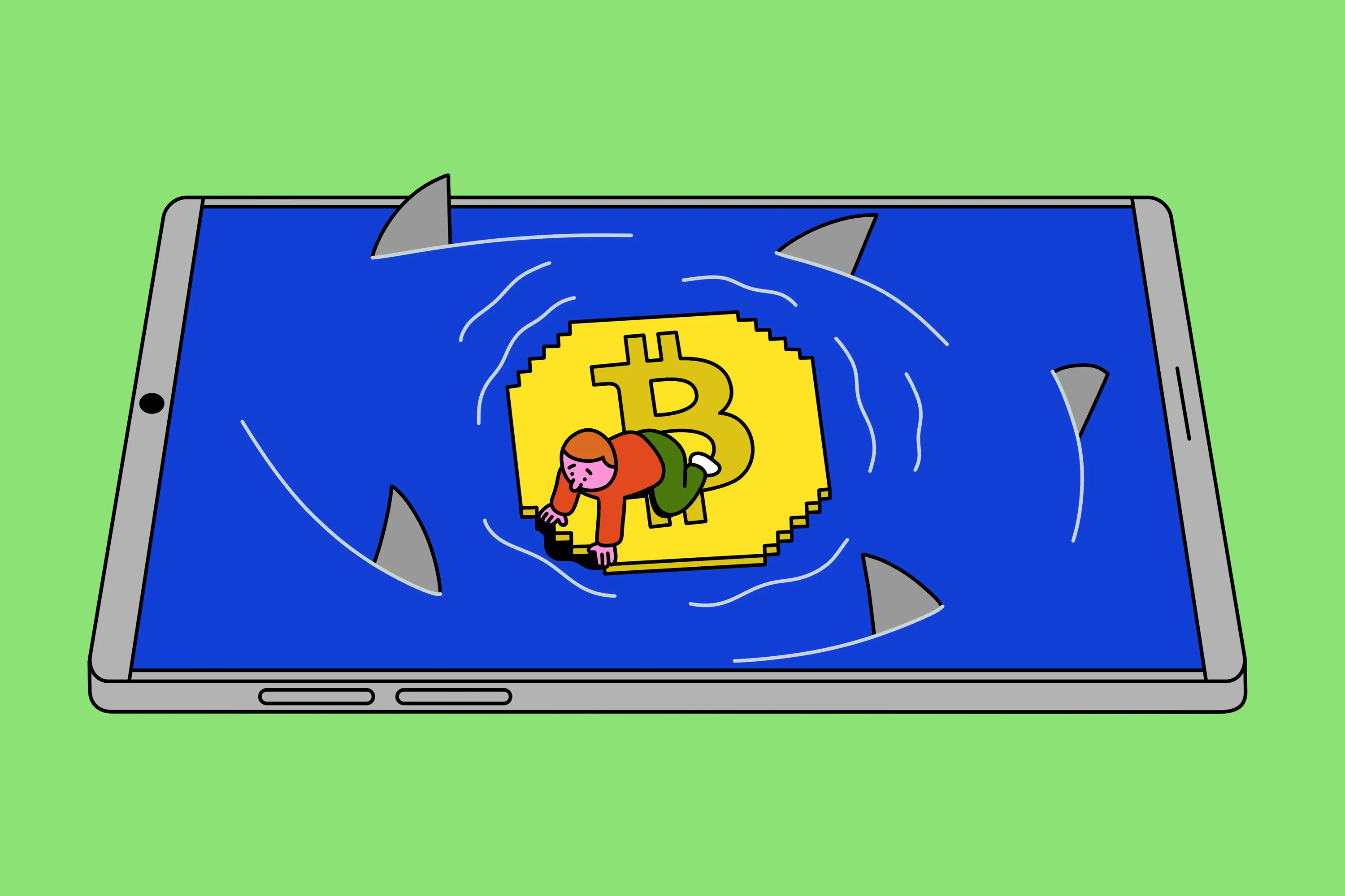
Permission Traps: Approvals That Quietly Hand Over Control
Permission design is one of the most dangerous areas of crypto UX because it turns abstract consent into direct financial authority. An approval or signature often looks like a routine step, but it can grant a contract the ability to move tokens later without further confirmation. When funds are drained days or weeks afterward, users rarely connect the loss to the original UX moment.
How permission traps usually appear
- Unlimited token approvals: spending caps are set to “infinite” by default.
- Vague copy: labels like “Approve” or “Sign to continue” without scope explanation.
- Details hidden: allowance amounts and contract addresses buried in expandable sections.
- Gasless signatures: off-chain permits that feel safer because no transaction fee is shown.
Real-world cases where UX enabled major losses
OpenSea phishing approvals. In 2022, users were tricked into signing approvals during what looked like a routine listing migration. The approval language was technical and poorly contextualized, and attackers later used those permissions to transfer NFTs without further interaction. Many victims reported that they never saw a clear warning that they were granting ongoing access.
Permit-based drains. Permit-style signatures were designed to reduce friction, but attackers learned to exploit user trust in “sign only” flows. In multiple reported cases through 2024 and 2025, users lost six and seven figure sums after signing a single permit that allowed later token transfers. The UX framed the action as a harmless confirmation step.
Wallet drainer campaigns. Drainer sites often request a sequence of signatures that look identical to legitimate interactions. Because wallets still struggle to clearly explain what a signature authorizes, users rely on the surrounding interface for context. When that interface is deceptive, the user has no reliable defense.

Why users underestimate approval risk
- Approvals feel routine: users sign them constantly.
- No immediate feedback: nothing happens at the moment of signing.
- Poor visualization: wallets rarely explain permissions in plain language.
Permission traps persist because they benefit both attackers and legitimate products that want frictionless flows. Until approvals are explained clearly and scoped safely by default, this pattern will continue to be one of the highest-impact sources of user loss.
Next, we will look at urgency and FOMO-driven interfaces that push users to act before they can evaluate risk.
Urgency and FOMO Interfaces: When Speed Replaces Judgment
Urgency is a classic dark pattern, but in crypto it carries extra weight because rushed actions are final. Interfaces that emphasize speed, scarcity, or time pressure push users to skip checks they would otherwise make. The faster the decision, the less likely a user is to question fees, permissions, or risk settings.
How urgency is commonly built into crypto UX
- Countdown timers: time-limited mints, claims, or bonuses.
- Scarcity indicators: “Only X left” or “Mint almost full.”
- Failure framing: warnings that a transaction will fail unless acted on immediately.
- Congestion prompts: pressure to increase gas to “avoid being stuck.”
Real-world examples users experience
NFT mint pages. Many mints display real-time counters showing remaining supply and time left. Even when the scarcity is artificial or the mint is not close to selling out, the interface creates anxiety that discourages careful review of the transaction details or contract permissions.
Airdrop claim portals. Claim pages often emphasize deadlines and network congestion. Users are encouraged to act quickly to “secure” tokens, even when claiming later would be cheaper or safer. In several phishing incidents, attackers copied these urgency cues to push victims into signing malicious approvals.
Gas escalation prompts. During high network load, wallets and dApps frequently recommend upgrading to faster execution. The messaging often frames this as a necessity rather than a tradeoff, leading users to pay significantly higher fees without understanding the marginal benefit.
Why urgency works in crypto
- Volatility fear: users expect prices to move quickly.
- Irreversibility: missing an opportunity feels worse than losing money.
- UI authority: warnings from the interface are trusted over intuition.
Urgency-driven UX does not need to lie to be dangerous. It only needs to frame speed as safety and hesitation as failure. In crypto, that framing reliably leads to bad decisions.
Next, we will examine abstraction overload, where “one-click” simplicity hides complex and risky operations.
Abstraction Overload: When “One Click” Hides Too Much
Abstraction is often presented as progress. In many cases it is. Fewer steps, fewer prompts, and fewer technical terms lower the barrier to entry. The problem appears when abstraction hides meaningful risk and removes the opportunity for users to understand what is actually happening to their funds.
In 2026, many crypto products bundle multiple protocol actions into a single button. What looks like a simple deposit or optimization often triggers a sequence of swaps, approvals, bridges, and contract interactions. When something goes wrong, users struggle to identify where the failure occurred or even where their assets are.
Common abstraction patterns that cause losses
- Multi-step actions masked as one: swaps, bridges, and deposits executed together.
- Friendly language: labels like “earn,” “optimize,” or “boost” replacing precise descriptions.
- Hidden dependencies: reliance on third-party contracts or bridges not disclosed up front.
- Opaque failure modes: partial execution without clear rollback or explanation.

Real-world examples of abstraction gone wrong
“Deposit and earn” flows. Yield platforms frequently combine a token swap, liquidity provision, and staking action into a single click. Users may not realize that their funds are locked, exposed to impermanent loss, or dependent on multiple smart contracts until returns drop or withdrawals fail.
Cross-chain actions. Interfaces often present bridging as a background process. When a bridge stalls or fails, users see only that funds have “left” the source chain. Without clear intermediate states, users panic, duplicate transactions, or pay extra fees trying to recover access.
AI-driven optimization buttons. Some platforms offer automated rebalancing or yield optimization powered by algorithms. The UX emphasizes performance while downplaying strategy changes, custody movement, or increased smart contract exposure.
Why abstraction becomes dangerous
- Loss of mental models: users cannot reason about risk they cannot see.
- Debugging is impossible: failures feel random and unfixable.
- Trust shifts to the interface: users assume the product will manage edge cases for them.
Abstraction should reduce friction, not remove understanding. When a product hides complexity without communicating risk, it creates a false sense of safety that often ends in confusion or loss.
Next, we will look at why these dark patterns persist in 2026, even as awareness and tooling improve.
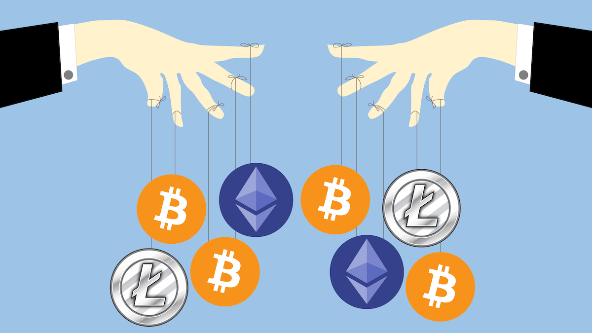
Why These Dark Patterns Persist in 2026
The continued presence of dark UX patterns in crypto is not mainly the result of bad actors. In most cases, it is the outcome of incentives, competition, and technical complexity colliding with fast-moving markets. Many of these interfaces are built by teams optimizing for growth, liquidity, or engagement, not user comprehension.
Structural reasons these patterns keep showing up
- Growth pressure: Products compete on speed and simplicity. Extra warnings and confirmations slow users down.
- Complex backends: Protocol mechanics evolve faster than UX standards. Interfaces often simplify because explaining everything feels impossible.
- Revenue alignment: Higher volume, higher leverage, and faster execution often benefit the platform.
- Blame diffusion: Losses are attributed to markets, users, or blockchains rather than interface choices.
There is also a cultural factor. Many crypto builders assume users should learn how things work. This mindset clashes with mass adoption, where users behave rationally by trusting the interface in front of them. When a product looks polished and familiar, people assume it is safe.
Regulation has started to focus on custody, disclosures, and licensing, but interface design still sits in a grey area. As long as dark patterns are framed as optimization instead of manipulation, they will continue to slip through.

How to Spot Crypto UX Dark Patterns Before You Lose Money
You do not need to become a power user to protect yourself. Most dangerous UX patterns repeat the same signals. Treat the following as a practical checklist rather than a rulebook.
Practical red flags to watch for
- Fees appear late: If the full cost only shows up at the final confirmation, pause.
- Risky settings are preselected: Defaults that increase slippage, leverage, or speed deserve scrutiny.
- Permissions feel vague: Any approval or signature without a clear explanation of scope is a warning sign.
- Urgency is emphasized: Timers, scarcity copy, or warnings designed to rush you are a signal to slow down.
- Actions are hard to explain: If you cannot describe what will happen to your funds in one sentence, do not click.
Simple habits that reduce risk
- Expand advanced details at least once before confirming a transaction.
- Lower default slippage and leverage settings manually.
- Treat signatures with the same caution as transactions.
- Walk away from interfaces that rely heavily on urgency or emotional language.
These steps do not eliminate risk, but they dramatically reduce the chance that UX alone causes an avoidable loss.
The Final Word: Better UX Is Not Always Safer UX
Crypto UX in 2026 is more approachable, more familiar, and more polished than ever. At the same time, losses increasingly come from design decisions rather than technical exploits. Hidden fees, deceptive defaults, permission traps, urgency screens, and over-abstraction all push users toward outcomes they did not actively choose.
The most dangerous interfaces are not the ones that look broken. They are the ones that feel effortless while quietly shifting risk onto the user. In crypto, clarity is not a luxury feature. It is a core part of security.
As products continue to chase adoption, the responsibility to design for understanding will matter as much as performance or speed. Until then, users who slow down and question the interface itself will be the ones least likely to lose money without realizing it.
Comments
Log in to post a comment
No comments yet
Be the first to share your thoughts!